Balanced Air®
Engineering a Timeless Identity for the Future of Air Care
Through a fine art-led design process rooted in molecular research, Orixun developed a sophisticated visual identity that transformed Balanced Air® into a quietly premium, instantly recognizable brand positioned between commodity air products and luxury design systems. The result is a brand that feels less like a product, and more like a movement redefining how environments breathe, feel, and function.
Balanced Air®
Engineering a Timeless Identity for the Future of Air Care
Through a fine art-led design process rooted in molecular research, Orixun developed a sophisticated visual identity that transformed Balanced Air® into a quietly premium, instantly recognizable brand positioned between commodity air products and luxury design systems. The result is a brand that feels less like a product, and more like a movement redefining how environments breathe, feel, and function.
Balanced Air®
Engineering a Timeless Identity for the Future of Air Care
Through a fine art-led design process rooted in molecular research, Orixun developed a sophisticated visual identity that transformed Balanced Air® into a quietly premium, instantly recognizable brand positioned between commodity air products and luxury design systems. The result is a brand that feels less like a product, and more like a movement redefining how environments breathe, feel, and function.
Project Overview
Brand Transformation
We completely reimagined Balanced Air® from the ground up, creating a high-end identity system designed to position the company as a category-defining premium brand.
Strategic Positioning
The brand was strategically positioned as an engineered alternative to traditional air care — focused on balance, precision, longevity, and performance rather than superficial solutions.
Fine Art Design Process
Instead of relying on generic industry visuals, the identity was developed through microscopic molecular research and conceptual experimentation inspired by oxygen and nitrogen structures.
Iconic Identity Development
Every element of the brand — from the logo geometry to typography and monochromatic palette — was meticulously refined to create an identity that feels timeless, architectural, and unmistakably premium.
Outcome
The final result elevated Balanced Air® into a sophisticated, future-facing brand with the presence, authority, and visual depth to stand apart entirely from conventional competitors.
The Challenge
The air care industry is saturated with generic branding built around predictable visual clichés — clouds, swooshes, gradients, and overly clinical aesthetics that lack emotional depth or distinction.
Balanced Air® needed an identity capable of transcending the category entirely. The goal was to create a brand that communicated scientific intelligence, premium craftsmanship, and environmental harmony without relying on obvious industry tropes.
The challenge was not simply to make the company look modern. It was to build a visual identity system with enough conceptual depth and refinement to feel iconic for years to come.
Our Approach
At Orixun, we approached Balanced Air® as a fine art and strategic positioning project rather than a standard branding exercise.
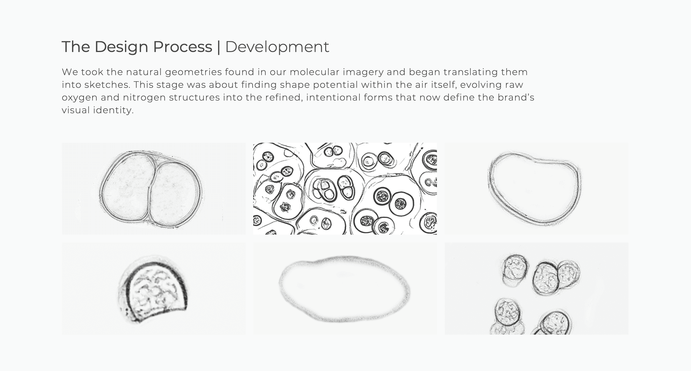
We began by researching the molecular structures of oxygen and nitrogen under microscopic imagery, studying the organic geometries naturally found within the foundations of air itself. These invisible forms became the conceptual DNA of the brand.
From there, we translated these molecular discoveries into a series of refined conceptual sketches, gradually evolving them into minimalist geometries that balanced scientific precision with emotional elegance.
Every stage of the process focused on restraint, intentionality, and timelessness. Nothing was added without purpose. Every line, proportion, spacing decision, and visual relationship was meticulously refined until the identity felt both engineered and artistic simultaneously.
The Identity System
The final identity system was built around the concept of perfect environmental equilibrium.
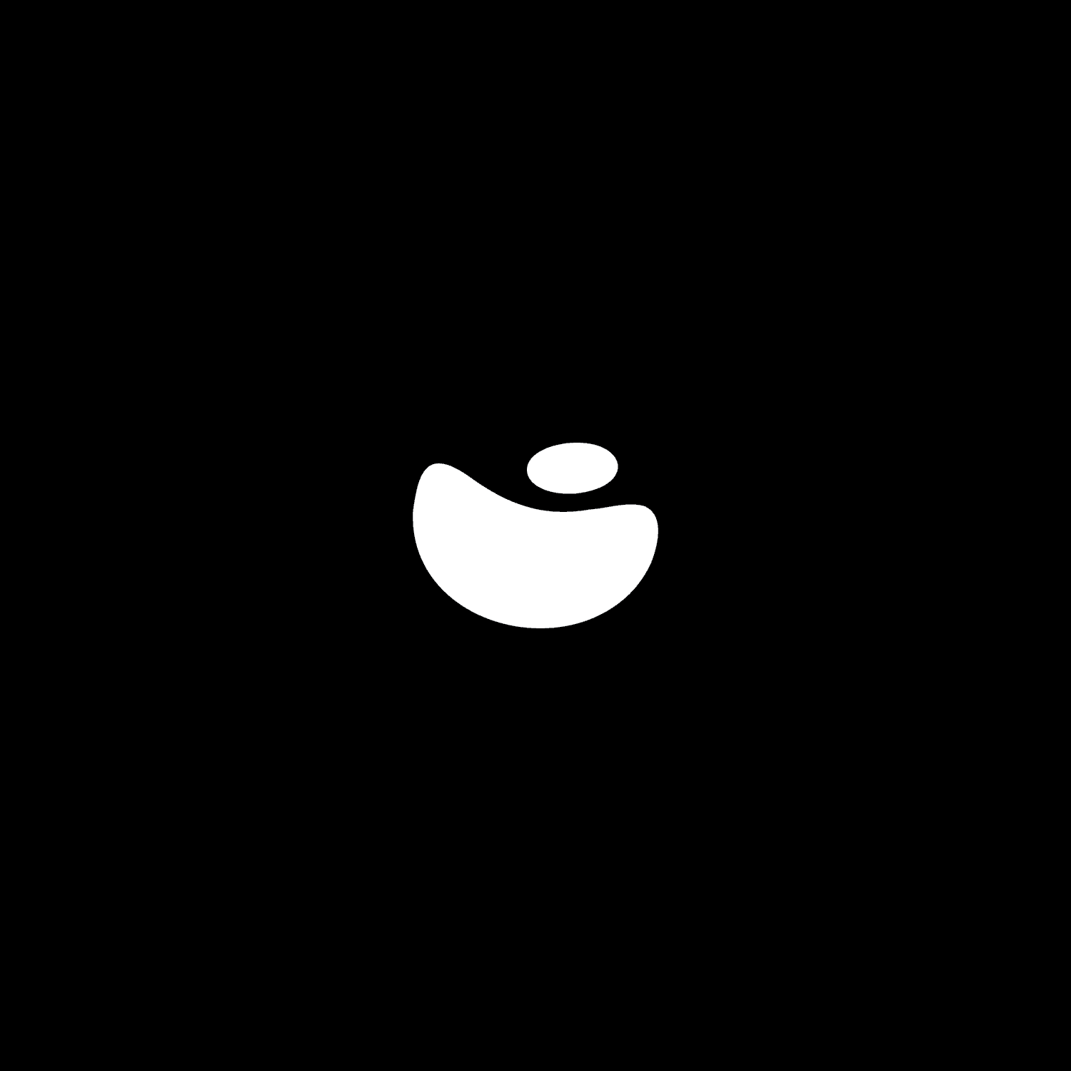
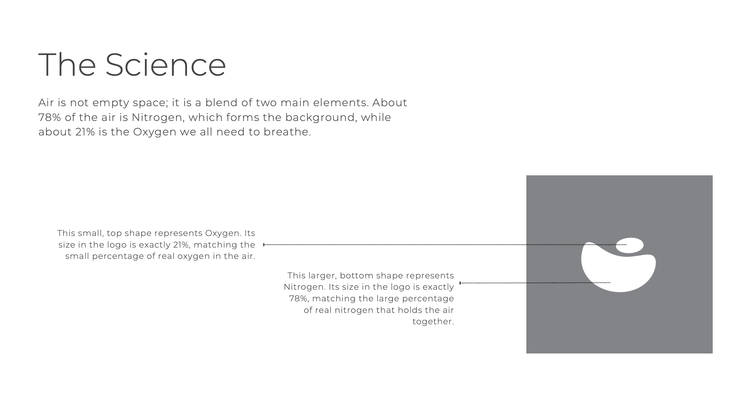
The logo itself became the embodiment of the Balanced Air® philosophy — a poised relationship between oxygen and nitrogen represented through carefully engineered asymmetrical geometry. The proportions directly reflect the real atmospheric composition of air, creating a mark with genuine conceptual depth rather than decorative symbolism.
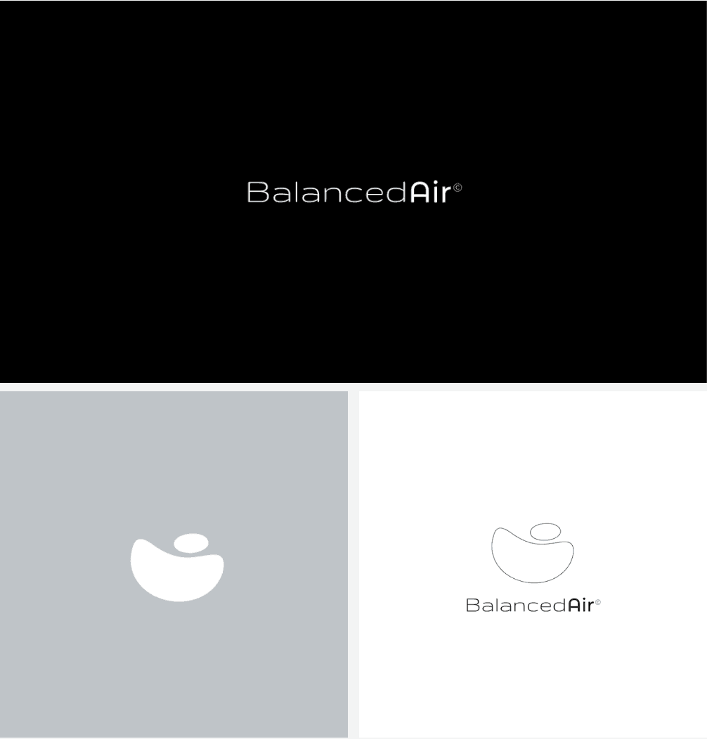
To reinforce the premium positioning, we developed a restrained monochromatic color system inspired by architectural minimalism and clinical purity. Deep blacks, crisp whites, and refined greys allowed the form and structure of the identity to take center stage without unnecessary visual noise.
Typography was selected with equal precision. The pairing of Gruppo and Montserrat Light created a balance between architectural sophistication and modern clarity, ensuring consistency across both digital and physical environments.
The Result
The transformation positioned Balanced Air® as a distinctly elevated presence within the market — modern, engineered, and instantly recognizable.
Rather than blending into the crowded air care space, the brand now stands apart with an identity that feels proprietary, intelligent, and culturally refined. Every touchpoint communicates calm precision, long-term quality, and scientific sophistication.
Orixun Brand Transformations
Convert Much More
Look More Credible
Increase Revenue
Dominate Your Area
Project Overview
Brand Transformation
We completely reimagined Balanced Air® from the ground up, creating a high-end identity system designed to position the company as a category-defining premium brand.
Strategic Positioning
The brand was strategically positioned as an engineered alternative to traditional air care — focused on balance, precision, longevity, and performance rather than superficial solutions.
Fine Art Design Process
Instead of relying on generic industry visuals, the identity was developed through microscopic molecular research and conceptual experimentation inspired by oxygen and nitrogen structures.
Iconic Identity Development
Every element of the brand — from the logo geometry to typography and monochromatic palette — was meticulously refined to create an identity that feels timeless, architectural, and unmistakably premium.
Outcome
The final result elevated Balanced Air® into a sophisticated, future-facing brand with the presence, authority, and visual depth to stand apart entirely from conventional competitors.
The Challenge
The air care industry is saturated with generic branding built around predictable visual clichés — clouds, swooshes, gradients, and overly clinical aesthetics that lack emotional depth or distinction.
Balanced Air® needed an identity capable of transcending the category entirely. The goal was to create a brand that communicated scientific intelligence, premium craftsmanship, and environmental harmony without relying on obvious industry tropes.
The challenge was not simply to make the company look modern. It was to build a visual identity system with enough conceptual depth and refinement to feel iconic for years to come.
Our Approach
At Orixun, we approached Balanced Air® as a fine art and strategic positioning project rather than a standard branding exercise.
We began by researching the molecular structures of oxygen and nitrogen under microscopic imagery, studying the organic geometries naturally found within the foundations of air itself. These invisible forms became the conceptual DNA of the brand.
From there, we translated these molecular discoveries into a series of refined conceptual sketches, gradually evolving them into minimalist geometries that balanced scientific precision with emotional elegance.
Every stage of the process focused on restraint, intentionality, and timelessness. Nothing was added without purpose. Every line, proportion, spacing decision, and visual relationship was meticulously refined until the identity felt both engineered and artistic simultaneously.
The Identity System
The final identity system was built around the concept of perfect environmental equilibrium.
The logo itself became the embodiment of the Balanced Air® philosophy — a poised relationship between oxygen and nitrogen represented through carefully engineered asymmetrical geometry. The proportions directly reflect the real atmospheric composition of air, creating a mark with genuine conceptual depth rather than decorative symbolism.
To reinforce the premium positioning, we developed a restrained monochromatic color system inspired by architectural minimalism and clinical purity. Deep blacks, crisp whites, and refined greys allowed the form and structure of the identity to take center stage without unnecessary visual noise.
Typography was selected with equal precision. The pairing of Gruppo and Montserrat Light created a balance between architectural sophistication and modern clarity, ensuring consistency across both digital and physical environments.
The Result
The transformation positioned Balanced Air® as a distinctly elevated presence within the market — modern, engineered, and instantly recognizable.
Rather than blending into the crowded air care space, the brand now stands apart with an identity that feels proprietary, intelligent, and culturally refined. Every touchpoint communicates calm precision, long-term quality, and scientific sophistication.
Orixun Brand Transformations
Convert Much More
Look More Credible
Increase Revenue
Dominate Your Area
Project Overview
Brand Transformation
We completely reimagined Balanced Air® from the ground up, creating a high-end identity system designed to position the company as a category-defining premium brand.
Strategic Positioning
The brand was strategically positioned as an engineered alternative to traditional air care — focused on balance, precision, longevity, and performance rather than superficial solutions.
Fine Art Design Process
Instead of relying on generic industry visuals, the identity was developed through microscopic molecular research and conceptual experimentation inspired by oxygen and nitrogen structures.
Iconic Identity Development
Every element of the brand — from the logo geometry to typography and monochromatic palette — was meticulously refined to create an identity that feels timeless, architectural, and unmistakably premium.
Outcome
The final result elevated Balanced Air® into a sophisticated, future-facing brand with the presence, authority, and visual depth to stand apart entirely from conventional competitors.
The Challenge
The air care industry is saturated with generic branding built around predictable visual clichés — clouds, swooshes, gradients, and overly clinical aesthetics that lack emotional depth or distinction.
Balanced Air® needed an identity capable of transcending the category entirely. The goal was to create a brand that communicated scientific intelligence, premium craftsmanship, and environmental harmony without relying on obvious industry tropes.
The challenge was not simply to make the company look modern. It was to build a visual identity system with enough conceptual depth and refinement to feel iconic for years to come.
Our Approach
At Orixun, we approached Balanced Air® as a fine art and strategic positioning project rather than a standard branding exercise.
We began by researching the molecular structures of oxygen and nitrogen under microscopic imagery, studying the organic geometries naturally found within the foundations of air itself. These invisible forms became the conceptual DNA of the brand.
From there, we translated these molecular discoveries into a series of refined conceptual sketches, gradually evolving them into minimalist geometries that balanced scientific precision with emotional elegance.
Every stage of the process focused on restraint, intentionality, and timelessness. Nothing was added without purpose. Every line, proportion, spacing decision, and visual relationship was meticulously refined until the identity felt both engineered and artistic simultaneously.
The Identity System
The final identity system was built around the concept of perfect environmental equilibrium.
The logo itself became the embodiment of the Balanced Air® philosophy — a poised relationship between oxygen and nitrogen represented through carefully engineered asymmetrical geometry. The proportions directly reflect the real atmospheric composition of air, creating a mark with genuine conceptual depth rather than decorative symbolism.
To reinforce the premium positioning, we developed a restrained monochromatic color system inspired by architectural minimalism and clinical purity. Deep blacks, crisp whites, and refined greys allowed the form and structure of the identity to take center stage without unnecessary visual noise.
Typography was selected with equal precision. The pairing of Gruppo and Montserrat Light created a balance between architectural sophistication and modern clarity, ensuring consistency across both digital and physical environments.
The Result
The transformation positioned Balanced Air® as a distinctly elevated presence within the market — modern, engineered, and instantly recognizable.
Rather than blending into the crowded air care space, the brand now stands apart with an identity that feels proprietary, intelligent, and culturally refined. Every touchpoint communicates calm precision, long-term quality, and scientific sophistication.
Orixun Brand Transformations
Convert Much More
Look More Credible
Increase Revenue
Dominate Your Area
Other Projects
Carefully curated design news, articles, resources and inspiration every week
Carefully curated design news, articles, resources and inspiration every week





Ready?
Book a free audit
We'll show you your top competitors, ranking scores, analytics and how we can completely transform your business and increase conversions by at least 30%.

Ready?
Book a free audit
We'll show you your top competitors, ranking scores, analytics and how we can completely transform your business and increase conversions by at least 30%.
Ready?
Book a free audit
We'll show you your top competitors, ranking scores, analytics and how we can completely transform your business and increase conversions by at least 30%.
Ready?
Book a free audit
We'll show you your top competitors, ranking scores, analytics and how we can completely transform your business and increase conversions by at least 30%.

Information
Copyright ©2026 by Orixun
Information
Copyright ©2026 by Orixun
Information
Copyright ©2026 by Orixun